Very often, particularly while helping someone non-technical with a technical problem, I think to myself "this would have been so much simpler/less confusing if the designer would have put just a bit more thought into the user experience." Similarly, I occasionally come across something where I say "man, why don't more people do this."
Yesterday, I had each of those reactions -- to the same piece of technology! So I had to share. What was this magical piece of technology that mixed both the good and bad design experiences? Why, a gas pump, of course.
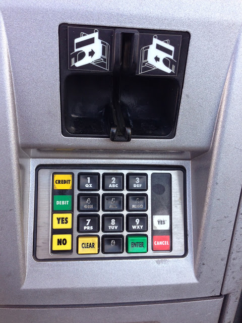
Take a look at this portion of the pump user interface. On the top, you have a credit card reader, and on the bottom, a keypad.
The Good:
The credit card magnetic stripe reader. They are everywhere: gas pumps, ATMs, grocery stores -- pretty much every brick-and-mortar retail outlet you can find has some form of this device. And it seems like every time I use one, I swipe my card, only to realize I had the mag stripe on the wrong side and have to flip it and swipe again.
So what's so good about this one? Well, take a look at the little helper pictures on the device. Did you see it? You can swipe the card with the mag stripe on... wait for it... either side. There is basically no way the user can do it wrong. The manufacturer has created a pit of success for me to fall into by adding a second receiving device on the other side. I LOVE IT!
This was the first thing I noticed on the gas pump, and I rejoiced. It put me in a better mood.
The Bad:
Immediately after swiping my card, the pump asked me to enter my zip code for credit card verification, followed by the dreaded "Do you want a car wash too?" prompt. Entering the zip code for credit card verification was straight forward -- I had a set of what is clearly a numbered keypad to use. So I tapped it in. No problem.
Now I get the "Do you want a car wash?" prompt. In my head, as I recall this little episode playing out, I hear this 80s era computer voice asking "Shall we play a game?"
Ok, I can do this -- "just press 'No'" I tell myself. So I reach down to the keypad and... um.. where's the 'No' key?
Now, it's hard to tell from the picture, but the 0-9 keys, plus the yellow "Clear" and green "Enter" are all raised, like an early 90s telephone. So this is a very familiar interface to me. The yellow and green colored buttons stand out to me -- clearly the designer gave them color to draw my eye to them. Then there are these stickers on the left and right side, which are also of various colors.
Here's how it played out in my head:
Ok, so, now, how to say "no"? Let's see, what are my options? There's no clear "No" key, but there is a "No" sticker next to the "Clear" key and they are both yellow -- so maybe that's it. But wait, there's a red "Cancel" label next to the green "Enter" key, and red usually means No -- but green means confirm and the key itself is green. Better go with the yellow "Clear" key.
I hit the key -- the machine beeps. The screen refreshed: "Do you want a car wash?". Ok, maybe it didn't register... so I pushed it again. And back comes the car wash prompt. (or, in my head "How about Global Thermonuclear War?"....) Clearly, this is not the right button.
To make a short story less long, here's where I landed: Turns out, those "stickers" on the side aren't just labels -- they're actual buttons. I probably should have taken the picture from a slight angle to make it more clear how much the buttons stick out -- but to me, it was not at all obvious that these were interactive components, especially since they are juxtaposed immediately with what are clearly interactive components. So I eventually hit the yellow "No" sticker and went on my way.
There is so much going on with this little 3" x 3" square of user interface.
- keys that are buttons
- stickers that are buttons
- stickers in yellow, red, green and white (what do those colors mean???)
- keys in black, yellow and green
As a user, I don't know what this all means, which means I'm likely to get it wrong, at least once. Had the buttons all been the same physical design, I would have immediately known which button to push.
It makes me wonder if the two parts of this user interface were designed by the same people.